Showing posts with label DSP. Show all posts

Sunday, June 5, 2011

Stamping 411 Saturday Sketch Challenge

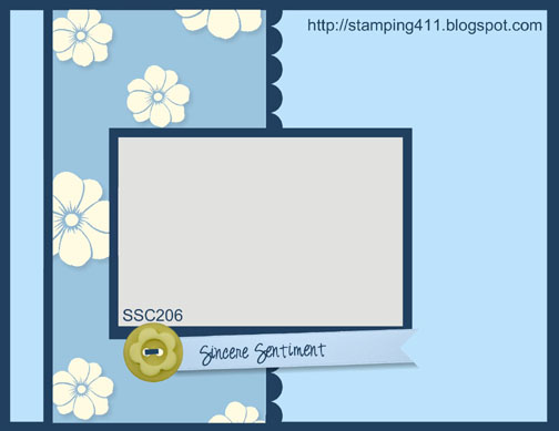
It's been a long time since I participated in a challenge of any sort...so today I decided it was long overdue.  My card today is for the Saturday Sketch Challenge for Stamping 411.  Here's the sketch...


This is a great sketch, and I love that the Operators of Stamping 411 include the measurements with their sketch, it's so much easier then me trying to figure it out through trial and error.


Supplies
Card Stock:  Wisteria Wonder, Pretty in Pink
Designer Series Paper:  Flirtatious
Classic Ink:  Wisteria Wonder, Pretty in Pink, Cherry Cobbler
Stamp Sets:  Delicate Doiles, Something to Celebrate
Punches:  1 1/4" Square Punch, Scallop Trim Border Punch
Accessories:  Perfect Polka Dots Textured Impressions Embossing Folders, SNAIL, Brights Designer Buttons, Whisper White Bakers Twine, Glue Dots

Tips
  1. I used the 1 1/4" punch to cut the angles on both ends of the greeting.
  2. On each end of the greeting I use a glue dot so that I could make the center of the greeting stand up.
This is definitely my last post for today, but I'll see you later this week.

Saturday, June 4, 2011

My Favourite Time of the Year

It's not Christmas.
It's not my birthday (I've had enough of those, I don't need anymore).
I'm not retiring (guess I do need a few more birthdays if I'm ever going to reach that point).
I'm not going on vacation.
So what the heck is it you ask.

It's new catalog time, yep SU!'s 2011-2012 catalog comes out on July 1st.  That means new stamps, new toys, and 5 new in-colors.  Since I'm a demonstrator I got to order some sneak peak products and with that order came the new catalog...and I gotta say I'm liking it, ALOT!

With the new catalog comes the last chance list; SU! needs to make room for the new products so unfortunately every year some stamps and products are retired.  I will be posting that list on the sidebar so be sure to check it out and if you see something you want you should order it quickly before it's sold out.

I can't show you the new products I ordered or the new catalog until July 1st, but I can show you some projects I made with the new products. 

So here's a card I made this morning with some of my new products.


Supplies
Cardstock:  Wisteria Wonder (my new favourite), Pool Party, Whisper White
Stamps:  Delicate Doilies
Designer Series Paper:  Flirtatious
Classic Ink:  Wisteria Wonder, Pool Party, Pretty in Pink
Punches:  Designer Label Punch, Modern Label Punch
Accessories:  SNAIL, Basic Pearls, 5/8" Satin Pretty in Pink Ribbon

Tips
  1. It's a pretty straight forward card, so just have fun with it!

I hope you like this card and I hope you are as excited about the new products as I am.  Be sure to come back soon to see what else I've made with my new products.


Saturday, April 2, 2011

A La Card Monkey Nature Challenge

It has been a long time since I've done any challenges, and I think it's time for me to start getting those creative juices flowing again.  As a SU! demonstrator there is a website called Stampin' Connection that we can access.  While looking through that website last night I found a discussion about a new challenge blog, so I needed to check it out.  It's called A La Card Monkey, and they will be doing weekly challenges.  The theme for this week's challenge is nature:


It's just a simple card, but who says there is anything wrong with simple?  I don't have many nature sets...hmmm, maybe I better do some shopping. 

Supplies
Card Stock:  Not Quite Navy, Watercolor, Soft Suede
Designer Series Paper:  Paisly Petals
Stamp Sets:  Spring Song (retired)
Ink:  Not Quite Navy, Soft Suede, Baja Breeze, Basic Black Craft Ink
Punches:  2-3/8" Scallop Circle, 2-1/2" Circle, Decorative Label Punch, Dotted Scallop Ribbon Border Punch
Accessories:  Basic Black Embossing Powder, Heat Tool, Embossing Buddy, Powder Pals, Basic Pearls, Paper Snips, SNAIL, Dimensionals, Vanilla Shimmer Smooch Spritz, Color Catcher, Aqua Painter

Tips
  1. You can't see the effect of the Smooch Spritz in the picture, but it really adds some shimmer to the card.
  2. The color catcher is a great tool to have when using the Smooch Spritz.
  3. Never try to do watercoloring without paper towel close by.  I always seem to get too much water on the picture, and dabbing the area with paper towel always does the trick.
  4. I used watercolor paper so I could do watercoloring on the bird, so I also used watercolor paper for the greeting; just so it would have the same look as the bird. 

Products
I just learned (I know, the whole world has known how to do this forever...) how to do screen shots, so now I can show you some of the SU! products I used. 

The Pearlized Smooch Spritz is a spray that adds some shimmer to your cards.


And the Color Catcher is just a box that you can leave set up to catch the spray so you don't get anything on the furniture.


These things are all in the 2010-2011 Idea Book and Catalog, but the Designer Series Paper isn't.  SU! has given us a little sneak peek of the 2011-2012 Idea Book and Catalog.

Doesn't that look fun!!

Anyway, on my last post I told you I would show you how to layer the Decorative Label Punch.  This is not something I came up with, I seen it done on a video on The North Shore Stamper.

To start you want to punch out 2 of the Decorative Label shapes in whatever color you are going to use for the layering.


With your Paper Snips cut each one of the shapes in half, one lengthwise and the other shortwise (is that a word?).


Then you want to cut the corner tips of each one.  The cuts don't need to be straight because you won't see it, you just don't want those points showing in the layers.


With the tips cut off use SNAIL to put the first layer on, it doesn't matter which one you do first, just be sure to either do the top and bottom, or 2 sides; not a top and a side. 


Honestly you could stop here if you wanted, just the top and bottom layer looks good.


After the top and bottom, use your SNAIL to add the 2 sides, so the back looks like this.

And the final product looks like this.


As always, let me know if you have any questions, and I hope you enjoyed my post today.

Sunday, February 27, 2011

Lap of Luxury

Good morning, wow, this is out of control, this is going to make a total of 3 posts in 1 week, there's no way Sherri (my SIL) is going to stay safe on the couch when she sees this one - apply your seatbelt Sherri, this is a double post.

My favourite color is purple (no, I'm not a Donny Osmond fan!), and one of the In Colors this year is Concord Crush, and to make that color even better there is Designer Series Paper (DSP) called Lap of Luxury that coordinates with the Concord Crush ~ yum!!!!

The base of this card is Concord Crush, and then I ran Very Vanilla through the Big Shot with the Perfect Polka Dots Textured Impressions Embossing Folder, and then use a Sponge Dauber and the Concord Crush Ink Pad to add some color to the Very Vanilla Cardstock.
I did the quilt style for today's card, cutting strips of the Lap of Luxury DSP in different widths and gluing them to a piece of cardstock 4" x 5" with my Anywhere Glue Stick.  I then rank it through my Big Shot with the Top Note Die, and then ran it through my Big Shot again with the Vintage Wallpaper Textured Impressions Embossing Folder.  Then I applied a piece of Sticky Strip across the center of the Top Note Die Cut and placed the Blushing Bride 1/2" Stitched-Poly Ribbon in a "jagged" type maner.

This is the final product...


Supplies
Stamp Sets: Occasional Quotes (level 3 hostess set)
Card Stock: Concord Crush, Very Vanilla
Designer Series Paper: Lap of Luxury
Ink: Concord Crush
Punches:  Decorative Label Punch, 2" x 1-3/8" Oval Punch
Accessories:  Big Shot, Vintage Wallpaper Textured Embossing Folder, Perfect Polka Dot Textured Embossing Folder, Sponge Daubers, Sticky Strip, SNAIL, Dimensionals, Blushing Bride 1/2" Stitched-Poly Ribbon, Basic Pearls, Paper Piercer, Mat Pack, Anywhere Glue Stick

Tips
  1. Make sure you have your card stock placed properly over the Top Note Die before you run it through the Big Shot.
  2. I applied the Anywhere Glue Stick all over the 4" x 5" card stock before I applied the strips of DSP, this makes it easier because you can "slide" the DSP into place before it dries.

When I make cards sometimes I make duplicates, and that was my intention this morning, but when I ran my card stock through the Big Shot with the Top Note Die, I didn't have the card stock placed properly over the Top Note Die (I was still working on my 1st cup of coffee I think) and so 1 side of the Top Note was cut off.  I didn't want to waste what I had left, so I improvised, and came up with this.


I don't really like this one as much as the first one, but overall it's not bad.

Supplies
Stamp Sets: Teeny Tiny Wishes
Card Stock: Concord Crush, Blushing Bride
Designer Series Paper: Lap of Luxury
Classic Ink: Concord Crush
Punches: Modern Label Punch, Work Window Punch
Accessories: Big Shot Square Lattice Textured Embossing Folder, Perfect Polka Dot Textured Embossing Folder, Sticky Strip, SNAIL, Dimensionals, Concord Crush 1/2" Stitched-Poly Ribbon, Basic Pearls, Anywhere Glue Stick

Tips
  1. Make sure you have your card stock placed properly over the Top Note Die before you run it through the Big Shot ~ but you know what they say "there are not mistakes in stampin', only opportunities"
I hope you enjoyed my post today.


Wednesday, February 23, 2011

Notably Ornate

Hi again, 2 posts in 1 week, WOW!  My sister-in-law left me a comment today saying she almost fell off the couch when she seen that I post.  Well, I wonder what 2 posts in 1 week will do to her?  LOL.

Today's card is made with the stamp set Nortably Ornate, I LOVE this set.  Why, you ask?  Well I really don't know why, but there is something about it that draws me to it.

Check out the card, maybe you'll see what I mean.


Isn't it fun!

Supplies
Stamp Sets:  Notably Ornate
Ink:  Basic Black
Cardstock:  Basic Black, Very Vanilla, Riding Hood Red
Designer Series Paper:  Love Letter
Punches:  Modern Label Punch
Accessories:  1 1/4" Basic Black Striped Grosgrain Ribbon, Paper Snips, SNAIL

Tips
  1. When cutting the ribbon, you only need to cut enough to fold over the edges ~ this way you just tape or SNAIL the ribbon to the back of the DSP.  It helps your ribbon go a little bit farther.
  2. The main image of the card was stamped on Very Vanilla card stock with Basic Black ink and then I cut it out with my Paper Snips.  I really hate cuting things, it is a pain; but I've learned that if you move the card stock as you're cutting, and not the Paper Snips it makes cutting a little easier.
  3. The "just because" was also stamped on Very Vanilla card stock and then punched out using the Modern Label Punch.  To do the layering with the Riding Hood Red card stock I punched out a piece using the Modern Label Punch and then cut it in half so that it layers the "just because" on both ends.
Well, that's all for today.  I hope you enjoyed my card.  And, Sherri I hope you didn't hurt yourself when you fell off the couch.

Sunday, September 12, 2010

Picture Perfect Creations Color Combo Part A

Good (Dark, Dreary) Afternoon Everyone...

I hope you all are doing something fun this weekend, and are someplace dry because it really looks like it is going to rain today.

For today's post I have 2 cards that I made for a color challenge at Picture Perfect Creations.  This color combo is almost spring like, and hopeful will put a smile on your face today.


I just got a new order in on Friday, so the cards I made have some fun new paper and embellishments on them. 

The first card is using Sunny Garden Designer Series Paper.  I love our DSP but I never use it enough, so hopefully you will be seeing more of it on my blog.


Supplies
Card Stock:  Marina Mist, Daffodil Delight, Peach Parfait
Paper:  Sunny Garden Designer Series Paper
Ink:  Marina Mist, Daffodil Delight, Peach Parfait
Stamps:  Cottage Garden
Punches:  Decorative Label Punch (in the new Holiday Mini pg. 25), Dotted Scallop Ribbon Border Punch
Accessories:  Paper Snips, Stamp-a-ma-Jig, Dimensionals, Elegant Lines Embossing Folder

Tips
  1. Check back this week, I'll show you how I did the layering for the Decorative Label Punch.
  2. I used the Stamp-a-ma-Jig to line up the flowers in the Cottage Garden Stamp Set, and then cut them with my Paper Snips.

Sunday, September 5, 2010

Happy Birthday

Today's card is for a color challenge at Scrapmaster's Paradise.  Be sure to check out her blog, it has some great ideas on it.  Here are the colors for the Scrapmaster's Paradise Color Combo #63.


Aren't they great colors, the Pacific Point and Rich Razzleberry are so rich.  The card I came up with is pretty simple.


I used the VersaMarker to add some Iridescent Ice Embossing Powder to the stamped gift image.  Here's an upclose look.


Kind of share looking.

Supplies
Card Stock:  Rich Razzleberry, Pear Pizzazz, Pacific Point, Whisper White
Paper:  In Color Patterns Designer Seriew Pper Stack
Stampin' Write Markers:  Pear Pizzazz, Pacific Point, Rich Razzleberry
Ink:  Black StazOn, Basic Black Classic Ink
Stamp Sets:  Happy Moments, Teeny Tiny Wishes
Punches:  2-3/8" Scallop Circle, 1-3/4" Circle, Word Window Punch, Modern Label Punch, Dotted Scallop Ribbon Border Punch
Accessories:  VersaMarker, Brights Brads, SNAIL, Mat Pack, Paper Piercer, Embossing Buddy, Iridescent Ice Embossing Powder, Heat Tool, Powder Pals

Tips
  1. I stamped the image before punching it out...too much work to try to stamp on an already punched out circle.
  2. VersaMark comes in a marker as well as a pad.  To get the Iridescent Ice Embossing Powder on the gift I colored the parts I wanted to emboss with the VersaMarker (after using the Embossing Buddy) then applied the Embossing Powder, and it only stuck to the areas where the VersaMarker was already applied.

Sunday, August 29, 2010

I Am "Disable" No More

Well, I had my surgery on my knee on June 4th, and I'm officially able to return to work.  As much as it's nice to not have to get up early in the morning, and to have no work related stress and responsibility, it's nice to get back into some sort of routine again.
Anyway, today's card is for 2 challenges.  The first challenge is for Pals Paper Arts.  They've made some changes to their blog recently so be sure to check them out.  Besides that, they have a very talented design team who make such beautiful creations.


The second challenge is for Stacey's Stamping Stage, who also has some beautiful creations.


This color challenge was just that, a challenge for me, I wasn't sure how to work the Crumb Cake into it.  But, I figured it out and this is what I came up with.


I used a technique on this card that I recently learned, see below for details.

Supplies
Card Stock:  Concord Crush, Pear Pizzazz, Crumb Cake, Whisper White
Paper:  In Color Designer Series Paper Pack
Stamps:  Fast and Fabulous, Elements of Style
Ink:  Basic Gray, Concord Crush, Crumb Cake
Punches:  1-3/4" Scallop Circle, 1-1/4" Circle, 1" Circle, 3/16" Corner
Accessories:  Brayer, Color Spritzer Tool, Sponge Daubers, SNAIL, Pear Pizzazz 1/2" Stitched-Poly Ribbon, Vintage Wallpaper Embossing Folder, Cutter Kit

Tips
  1. To get the background look I embossed a piece of Pear Pizzazz Card Stock with the Vintage Wallpaper Embossing Folder, and then using a Brayer and Concord Crush Classic Ink I lightly rolled the ink over the debossed side of the card stock.  It's really important that you Brayer lightly because you don't want to get ink into the debossed part of the pattern.
  2. I used the Corner Punch on the 2 right sided corners, and then used the Cutter Kit to distress the edges.
  3. I used the Color Spritzer with Concord Crush and Crumb Cake ink on the stamped image.
  4. The pattern on the DSP is the same as the pattern from the Embossing Folder.

Tuesday, August 3, 2010

In Colors

Since I had the In Colors and Just Believe stamp set out to make my card for the Pals Paper Arts I decided to make a second card with these supplies. I absolutely LOVE the Concord Crush so I'll use any reason I can to make a card with that color.  Oh, and I did this card all by myself, no sketch, no color challenge, no nothing, just me...if you can believe it!  LOL


Supplies
Stamps:  Just Believe
Paper:  Concord Crush, Pear Pizzazz, Peach Parfait, In Color Patterns Designer Series Paper Stack
Accessories:  Pear Pizzazz 1/2" Stitched-Poly Ribbon, Cutter Kit, Sponge Daubers, SNAIL

Tips
When I stamped the flowers in the Concord Crush and Peach Parfait I stamped once with the stamp all inked up and then without re-inking the stamp I stamped again, this gives the stamp a light look.  You can also do this by inking your stamp, stamping on a scrap piece of paper (called 'stamping off') and then stamping your image on your cardstock.

Have a great day!!

Sunday, July 25, 2010

Pals Paper Art Sketch Challenge #52

Hello everyone!  Today's card is a relatively simple one that I made for the Pals Paper Arts Sketch Challenge #52.  Check out their blog, they have a very talented design team and create wonderful cards for their challenges.  Here is the sketch for this weeks challenge.


I used the new In Colors and some new products for this card.


Supplies
Stamps:  Just Believe
Paper:  Concord Crush, Pear Pizzazz, Peach Parfait (kind of sounds like a fruit salad LOL), In Color Patterns Designer Series Paper Stack, Whisper White
Ink:  Concord Crush, Peach Parfait
Punches:  2-3/8" Scallop Circle, 1-3/4" Scallop Circle, 1-3/8" Circle, 1-1/4" Square 
Accessories:  Vintage Wallpaper Embossing Folder, Pear Pizzazz 1/2" Stitched-Poly Ribbon, Dimensionals, SNAIL

Tips
The circle stamp in the Just Believe coordinates perfectly with the 1-3/8" Circle Punch.
SU! has several stamps that coordinate with their punches, and they identify which stamps coordinate with which punches all throughout the Idea Book and Catalog.
There are now 2 different Scallop Circle Punches available which is great for layering.
I used the 1-1/4" Square Punch to make the cut on the edge of the Peach Parfait cardstock

Thanks for checking out my blog today.  Feel free to email me if you have any questions.

Thursday, July 8, 2010

Mojo Monday...Again

I've made a second card to enter into the Mojo Sketch 146 contest at Mojo Monday - The Blog. This is the sketch for this week's contest.


The card I made for this one uses similar colors as the one posted yesterday, but has a totally different look to it.


Supplies
Stamps: Watercolor Trio
Ink: Old Olive and Cherry Cobbler Stampin' Write Markers
Paper: Basic Black, Cherry Cobbler, Whisper White, Newsprint DSP
Punches: Large Oval, Scallop Oval
Accessories: Basic Black 1 1/4" Striped Grosgrain Ribbon, SNAIL, Dimensionals, Paper Snips, Glue Dots

Tips
The butterfly was cut out with my Paper Snips and a Dimensional was used to give it a little dimension.

I hope you enjoy this card, thanks for stopping by and I hope you have a great day.

Wednesday, July 7, 2010

Mojo Monday Sketch 146

Today's post is for Mojo Monday.sketch challenge #146


I used the new Newsprint DSP for this card, I love this paper and was glad to finally find a way to use it.


Supplies
Stamps: Vintage Vogue, Watercolor Trio
Paper: Newsprint DSP, Basic Black, Cherry Cobbler, Baja Breeze, Whisper White
Ink: Cherry Cobbler and Marina Mist
Punches: Modern Label, Scallop Oval, Large Oval
Accessories: Basic Black 5/8" Grosgrain Ribbon, Silver Brads, Paper Snips, Paper Piercer, Dimensionals, SNAIL

Tips
I don't have the Oval Original Die yet, so I used my Cricut to cut the ovals.
The Vintage Vogue also has a leaf stamp, so you could add to the flowers if you wanted. I decided not to do that, for no reason really.
The Baja Breeze oval is stamped randomly with the flouish stamp from Vintage Vogue.
I don't have my Baja Breeze ink pad yet, so I stamped the small flower with Marina Mist. You can barely tell the difference, but if you can I would stick with the Baja Breeze ink. I didn't think of it at the time, but you could color the small flower with the Baja Breeze marker and do the huff and stamp technique.
The flowers were stamped on Whisper White and then cut with the Paper Snips

I hope you enjoy this card, I would love to know what you think

Saturday, June 26, 2010

Mojo Monday Sketch Challenge # 144

Hi All. Today's post is for a sketch challenge from Mojo Monday - The Blog.


I played around with this sketch and the colors for this card and came up with 2 different but very similar cards. For the first card I used Crumb Cake as the base, and I really like how it looks with the Regal Rose. It's funny, I never really Crumb Cake (formerly known as Kraft) before, but now that it is one of the core SU! colors in the Neutrals Collection I'm using it a lot more, and I really like it.


Supplies
Stamps: With All My Heart and Vintage Labels
Paper: Crumb Cake, Regal Rose, Very Vanilla, Bride Speciality Paper, Sending Love Specialty Paper (from the Occasions Mini Catalog)
Ink: Regal Rose, Bashful Blue Early Espresso and Crumb Cake
Punches: Extra Large Fancy Flower and Curly Label
Embellishments: Basic Jumbo Grommets, Soft Subtle Brads, Regal Rose 5/8" Grosgrain Ribbon
Accessories: Paper Piercing Tool and Mat Pack, Stamping Sponges, Dimensionals and SNAIL

Techniques
I made my own designer series paper by stamping on the Crumb Cake base with Crumb Cake Ink. The Bride Specialty Paper is white, so I sponged over it using a Stamping Sponge and Regal Rose Ink, then wiped off the excess ink so that there is still some shine in the design on the paper I give the look of depth I sponged the edges all of the card stock and DSP.

The second card is very similar, I basically used different colors, and a few different embellishments.


Supplies
Stamps:
With all My Heart, Vintage Labels
Paper: Marina Mist, Bride Specialty Paper, Regal Rose, Sending Love Specialty Paper, Very Vanilla
Ink: Marina Mist, Regal Rose
Punches: Extra Large Fancy Flower, Curly Label, Boho Blossoms and 1/2" Circle
Embellishments: Rich Regal Brads, 5/8" Regal Rose Grosgrain Ribbon, 5/16" Jumbo Brads
Accessories: Stampin Sponges, Dimensionals, SNAIL, Paper Piercing Tool and Mat Pack

I'm not sure if you can enter more than one card to the Mojo Monday challenge, so I have to decide which one of the two I like best. I would love from eveyone on their thoughts which card I should enter.

Tuesday, June 8, 2010

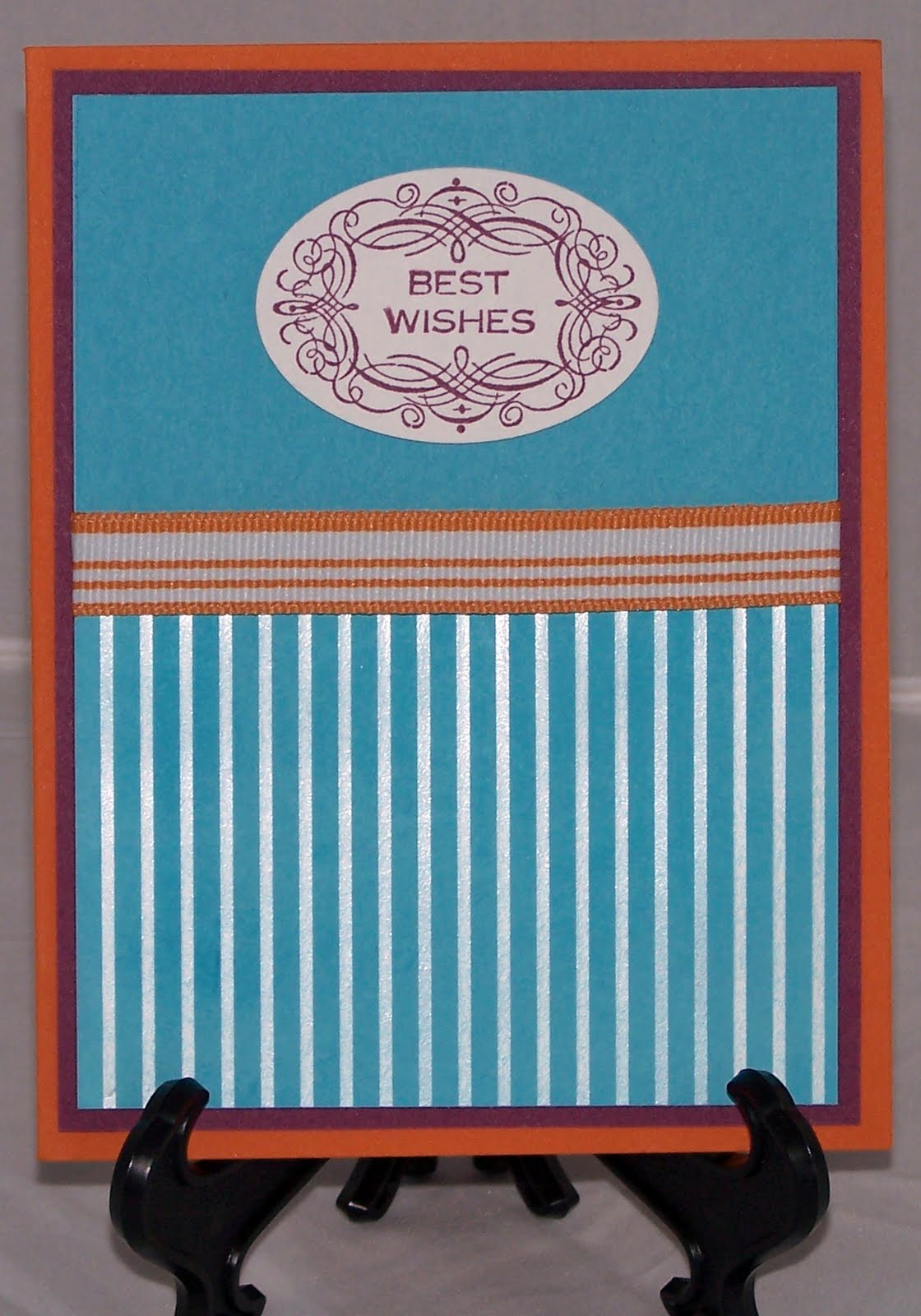
Diva Coffee Break Designs 179

I made this card for the Diva Coffee Break Design challenge, but I was too late to post it on their website.
All products are SU
Paper: Rich Razzleberry, Pumpkin Pie and Tempting Turquoise cardstock; Bride Speciality Paper brayered with Tempting Turquoise classic ink
Stamps: SAB Vintage Labels
Ink: Tempting Turquoise and Rich Razzleberry
Accessories: Pumpkin Pie Stripped Grossgrain Ribbon

I hope you enjoy it.